Blog 09 Feedback in my portfolio review
This blog is about the feedback I received in my portfolio review tutorial and some changes I made to improve.


This week I showed my website in the tutorial, and received the feedback which remind me of several problems I did not notice before. The main problems focus on the readability and content of my portfolio.
Readability:
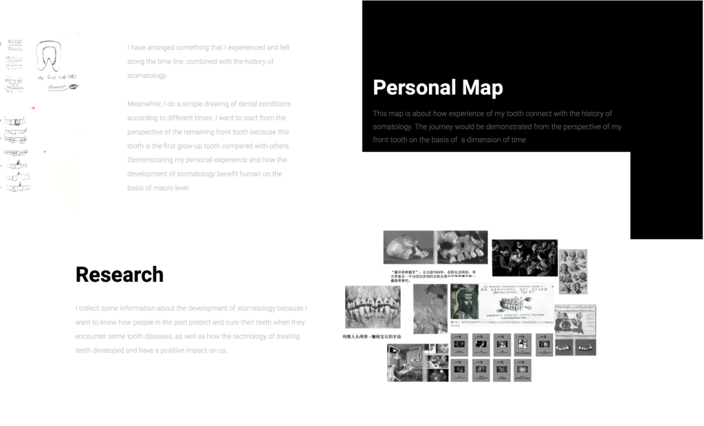
- The color of the text is not suitable, which makes it hard to read. For example, using a gray font color on a black background or a white background causes the text to be indistinguishable from the background.

- The relationship between the image and the background should also be considered when placing the picture. If a dark picture is placed on a black background, it will cause the picture to be submerged in the background.
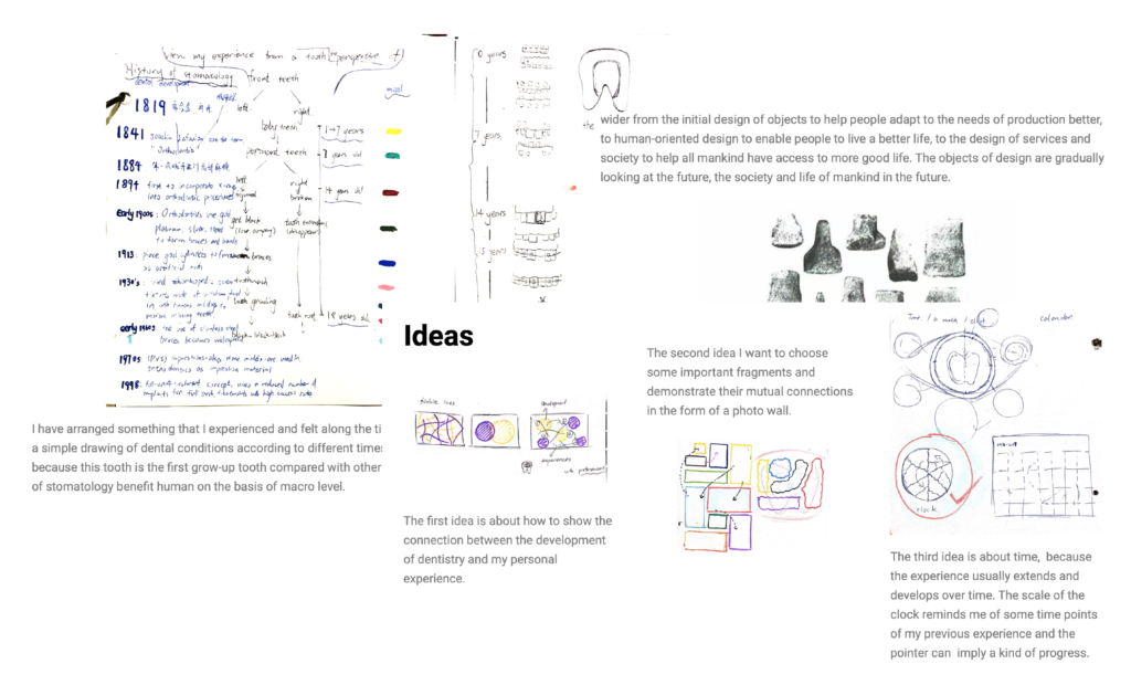
- The picture is too small to read, which causes some details is difficult to see.
Then, I adjusted the color of the font to black, and enlarged the font size to make the text easier to read. I enlarged some pictures which showing the key process to the entire page. Changing the background uniformly to white to make the whole page more clear and easy to read.

Content:
The content of project show the outcome directly at first and I should make more process of my work visible. Demonstrating how my project developed step by step to the final product through sketchbook and other screen-shots.
Additional notes:
I did not add the reference of image before, and I should label the source of the image if it is not my work.